Fern is a restaurant that focuses on ingredients foraged from the wild and taken from a small organic farm - natural food carefully prepared, offering a dining experience.
Challenge:
Create a branding for Fern that reflects its values, speaks to their audience and helps to create an unforgettable experience for their guests.
Outcome:
A branding including a word-mark and accompanying mark of quality, fonts, colors and image style applied to branded material that caters to mindful, curious and health conscious people, looking to re-energize themselves with more than just a meal.
Scope:
Strategy
Branding and Identity Design
Branded Collateral
Marketing Brochure


Brand Definition:
Our first step was to create an objective roadmap that all strategic and design decisions are checked against.
It helps to keep us and the to client focused, refine the brand, but also prevents going in directions that will muddy the outcome or even hurt the brand.
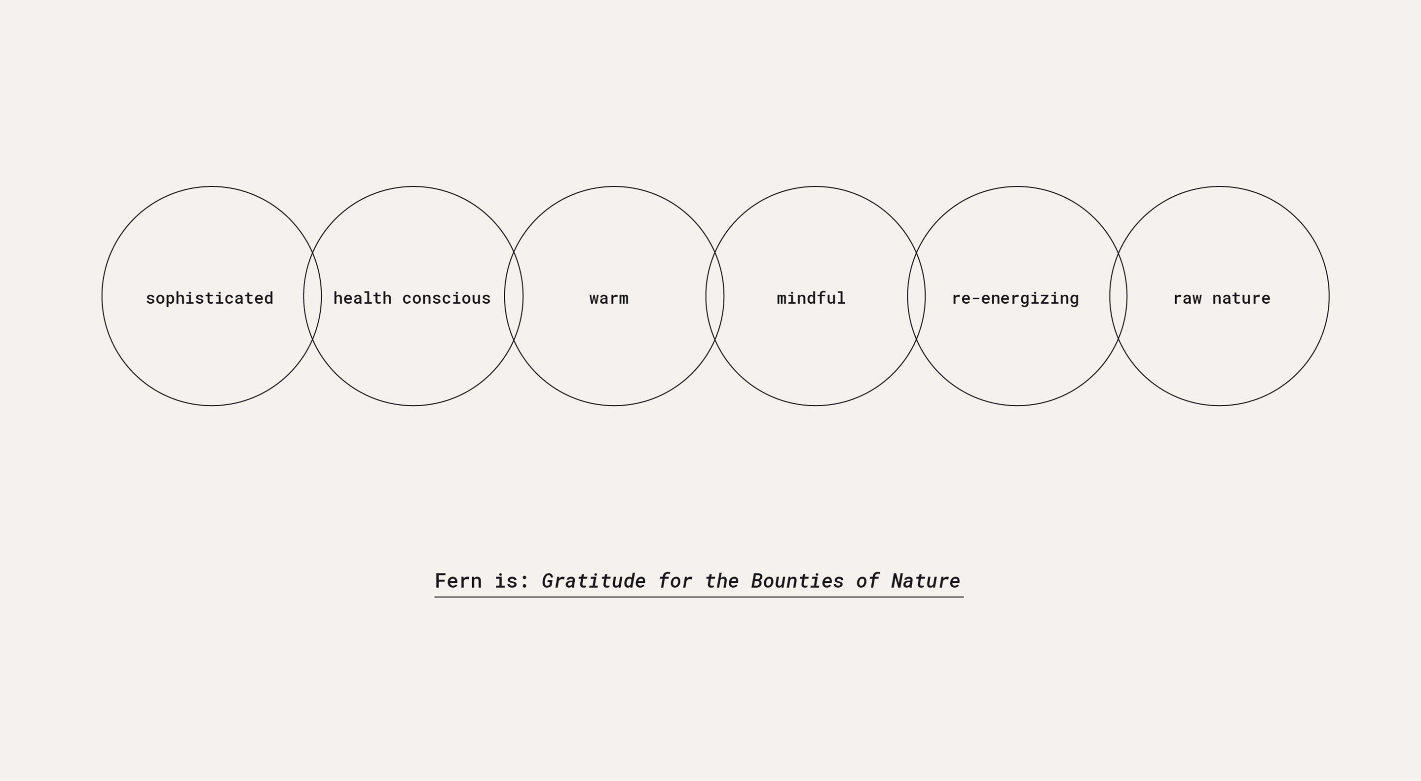
As part of our strategic approach we conducted a brand exploration session to discover and clarify Fern’s goals, brand attributes and their customers needs. After reviewing the results, a statement was formed to describe the brand's mission.
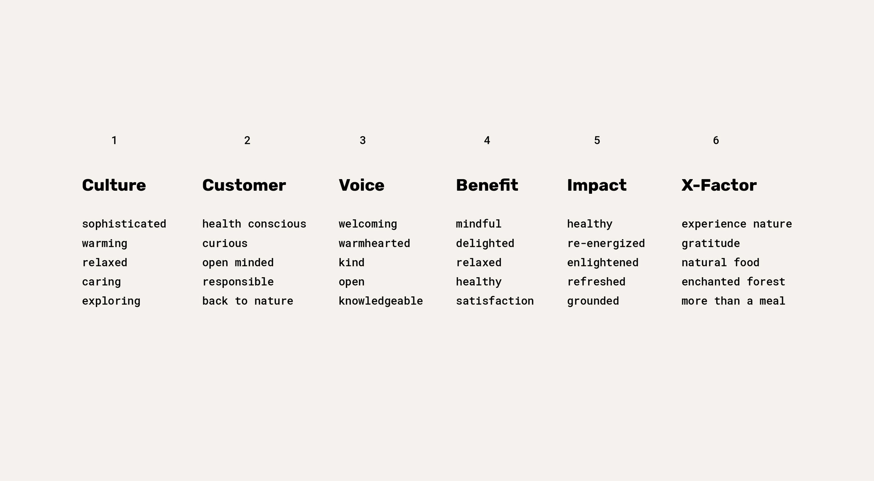

Next we defined the brand itself to set a creative tone for the branding. Looking at the brand attributes, a pattern emerged: gratitude towards nature, warmth, care and attention, re-energizing food and a feeling of magic of the forests and streams. Translating the promise of experiencing the magic of the forest was a critical point. It had to be taken seriously and demanded not to go into any whimsical directions but treated with the sophisticated and mindful approach Fern has towards nature. At the same time the brand should feel curious and modern and not too stiff or overbearing.
Branding:
After the tone was established we made sure our client’s and our own perceptions and understanding of the goals were aligned and began to work on the branding.
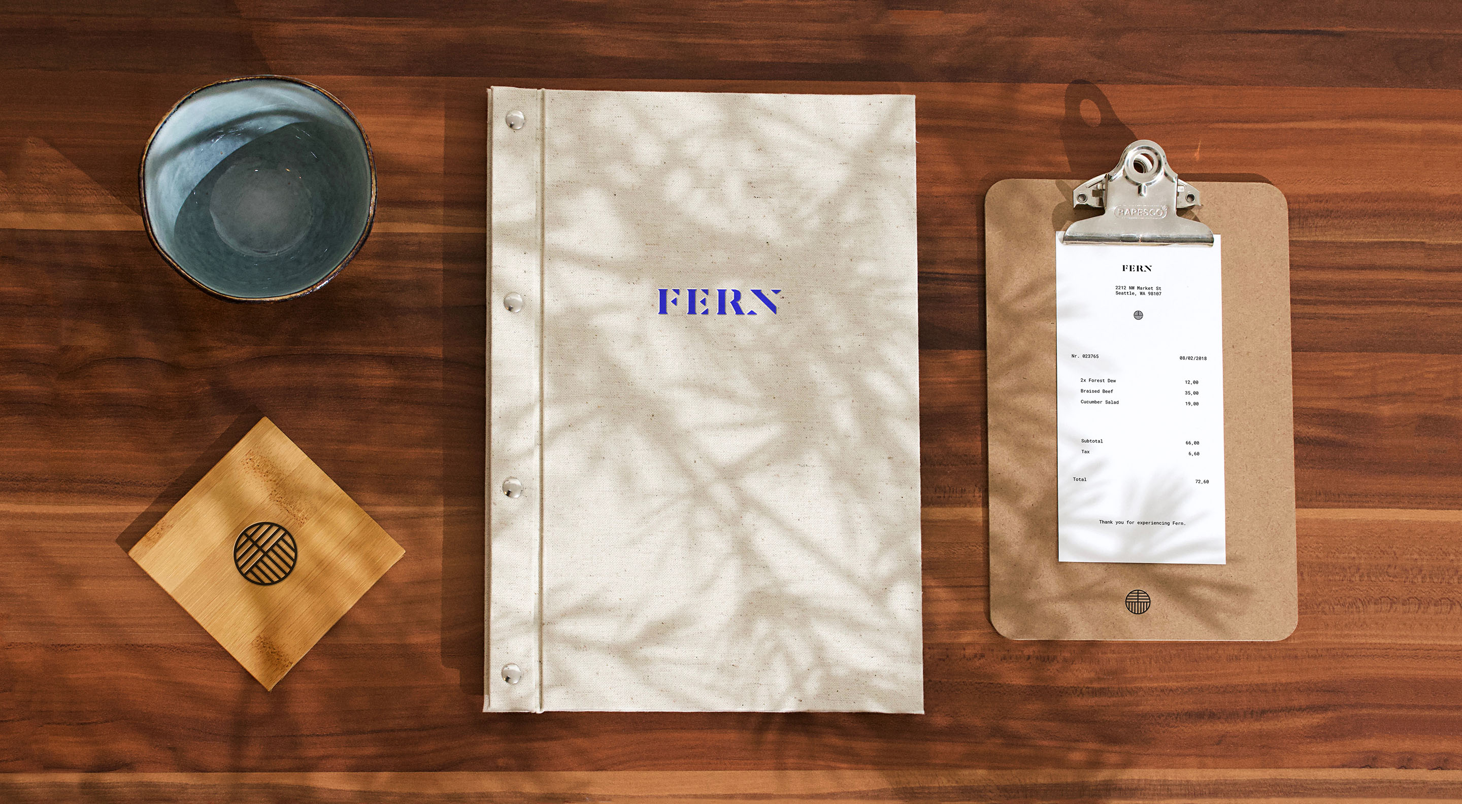
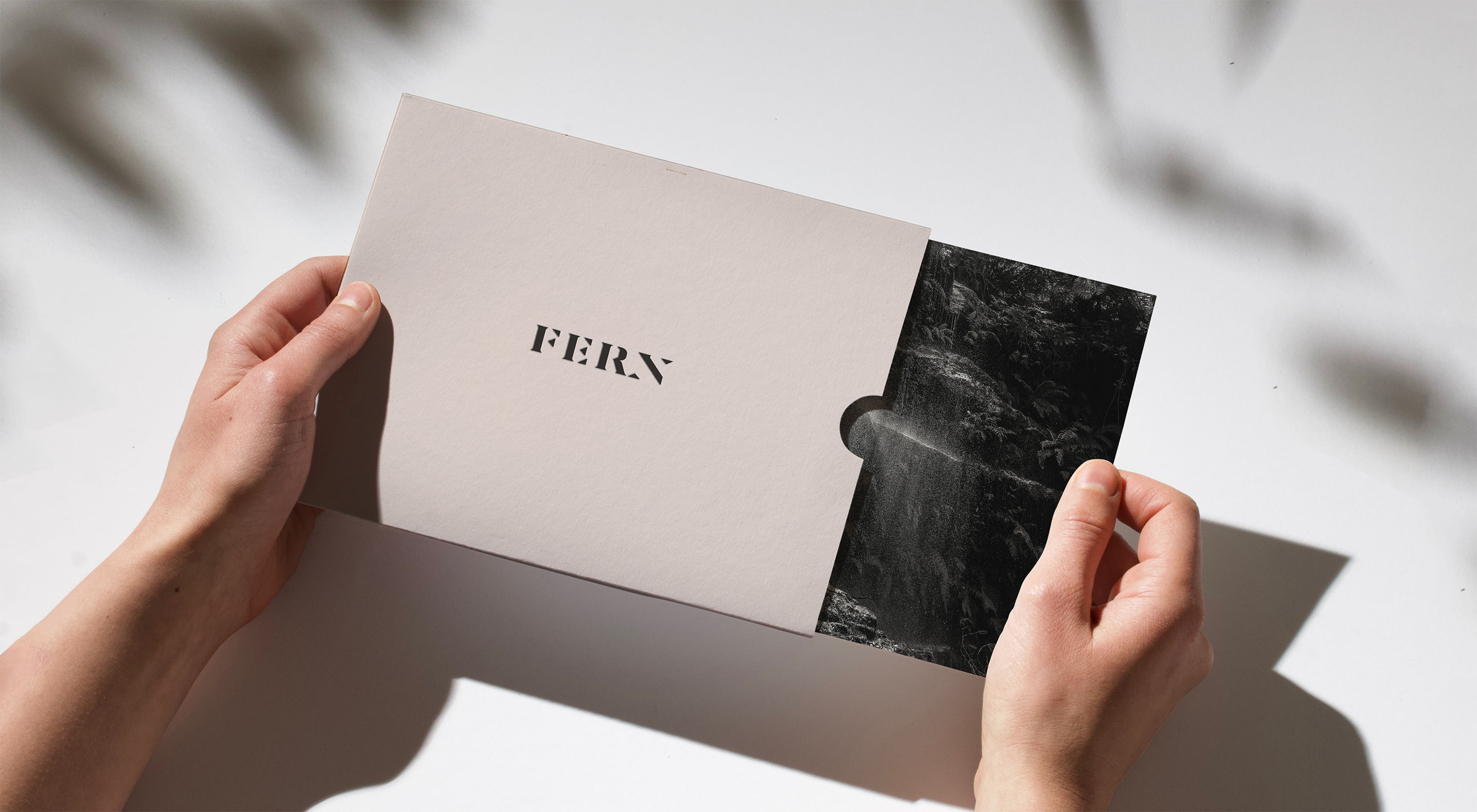
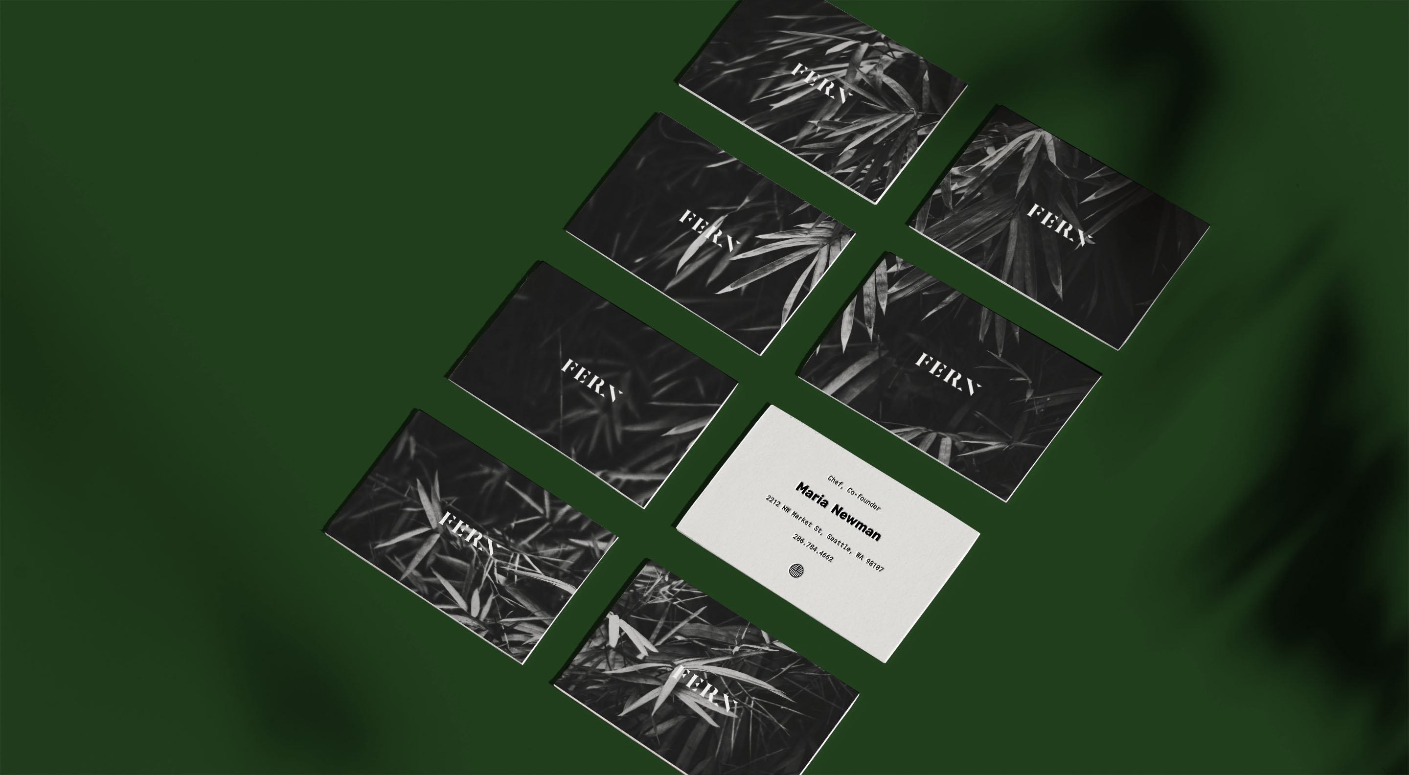
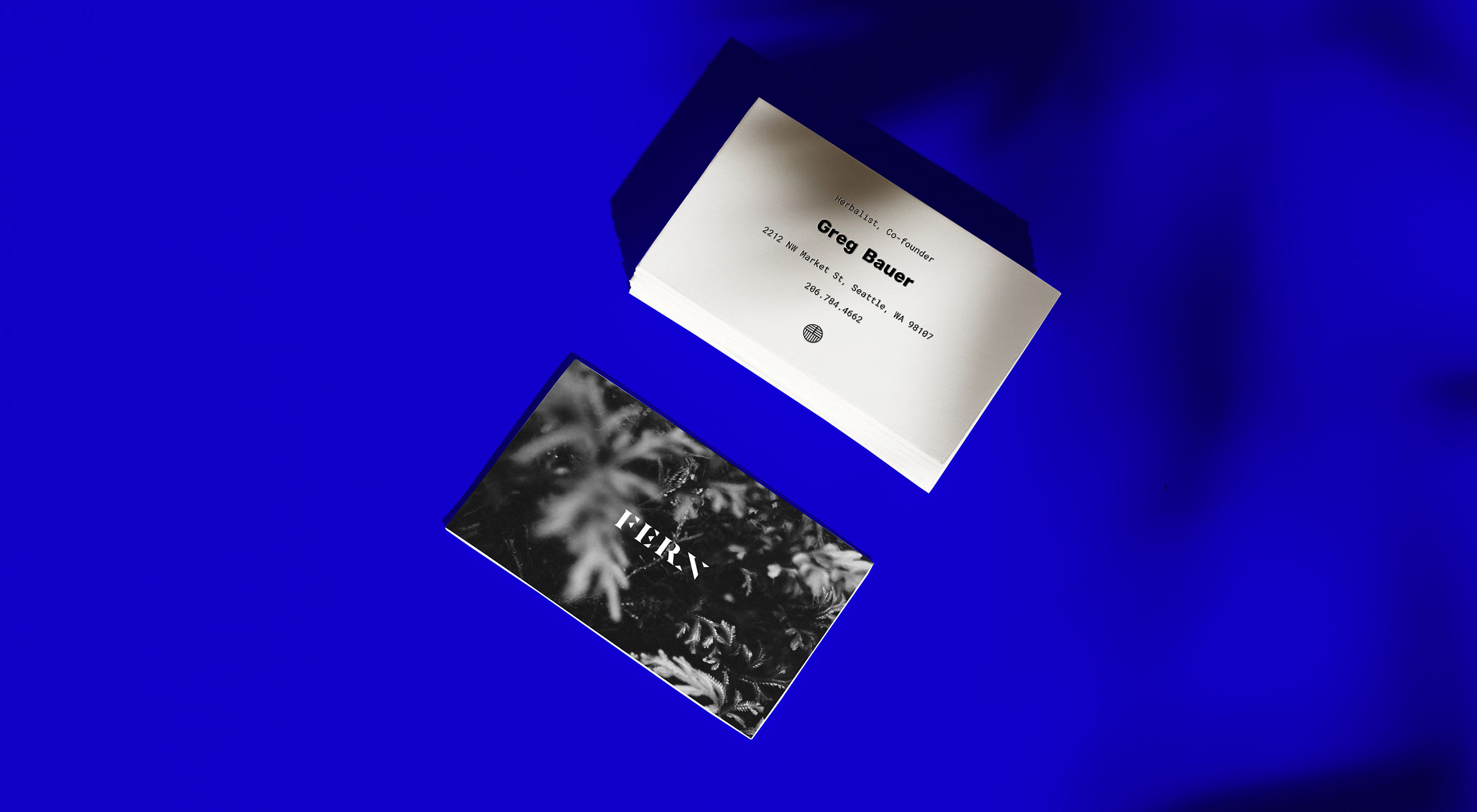
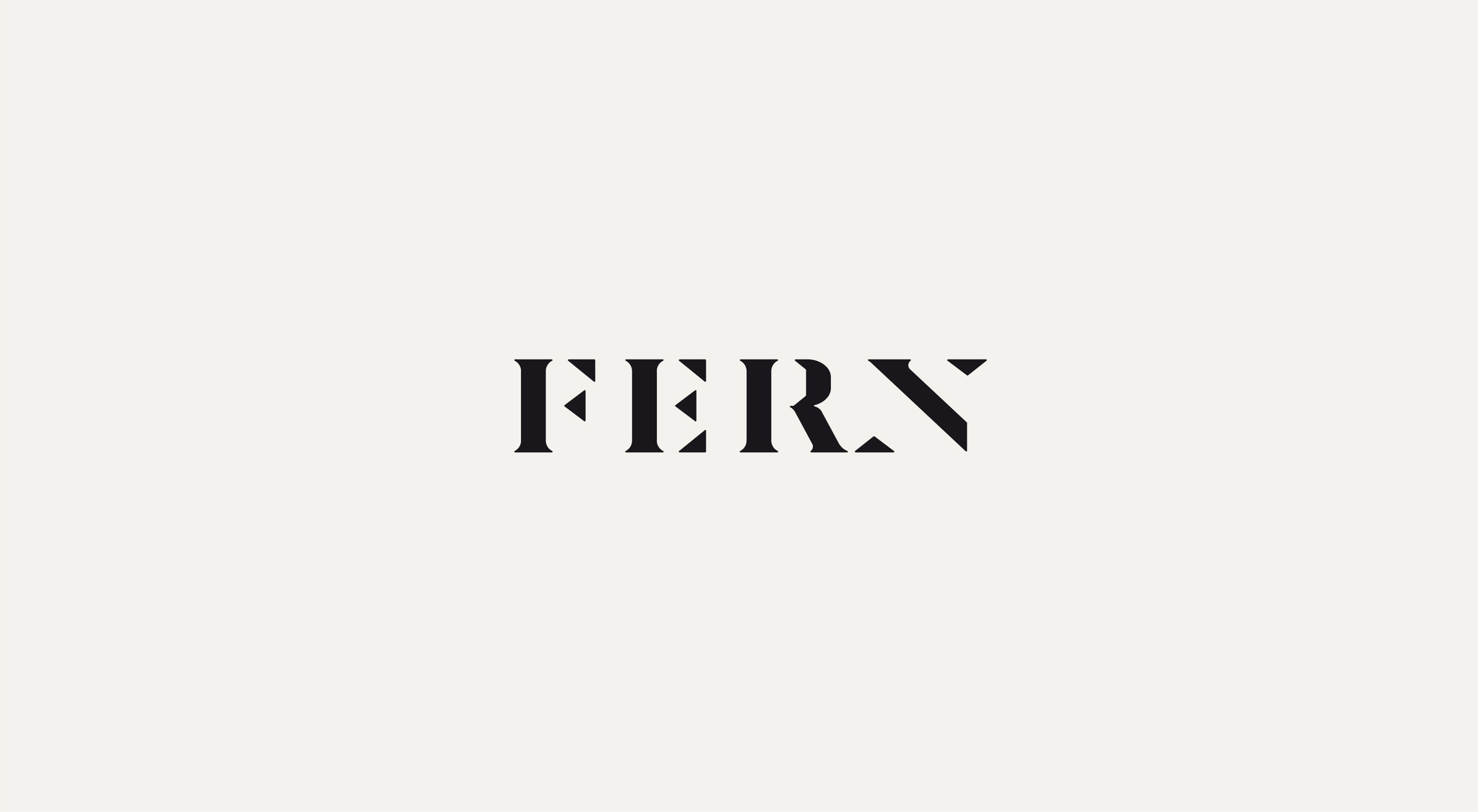
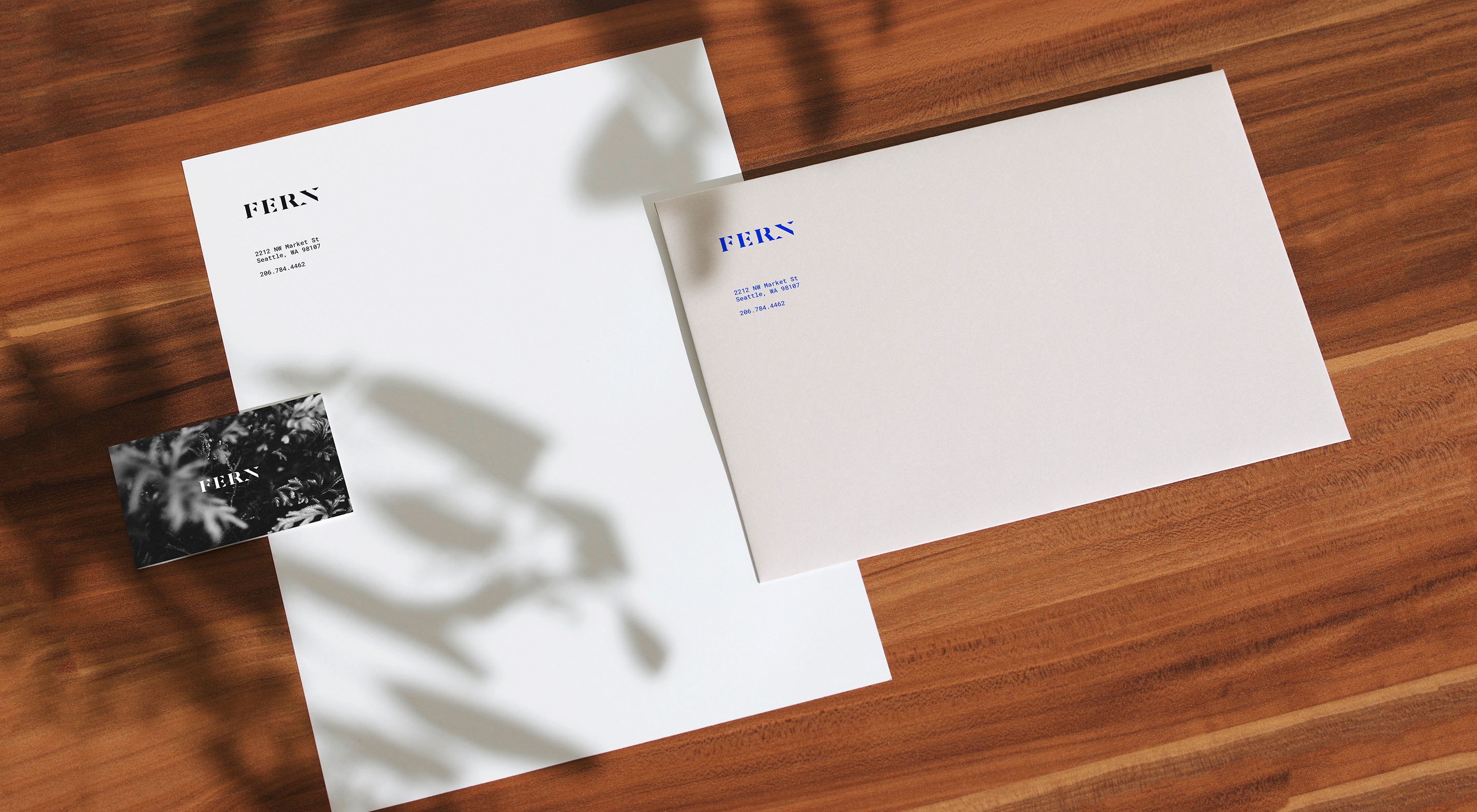
We created a custom word-mark that is sophisticated and clean without feeling cold.
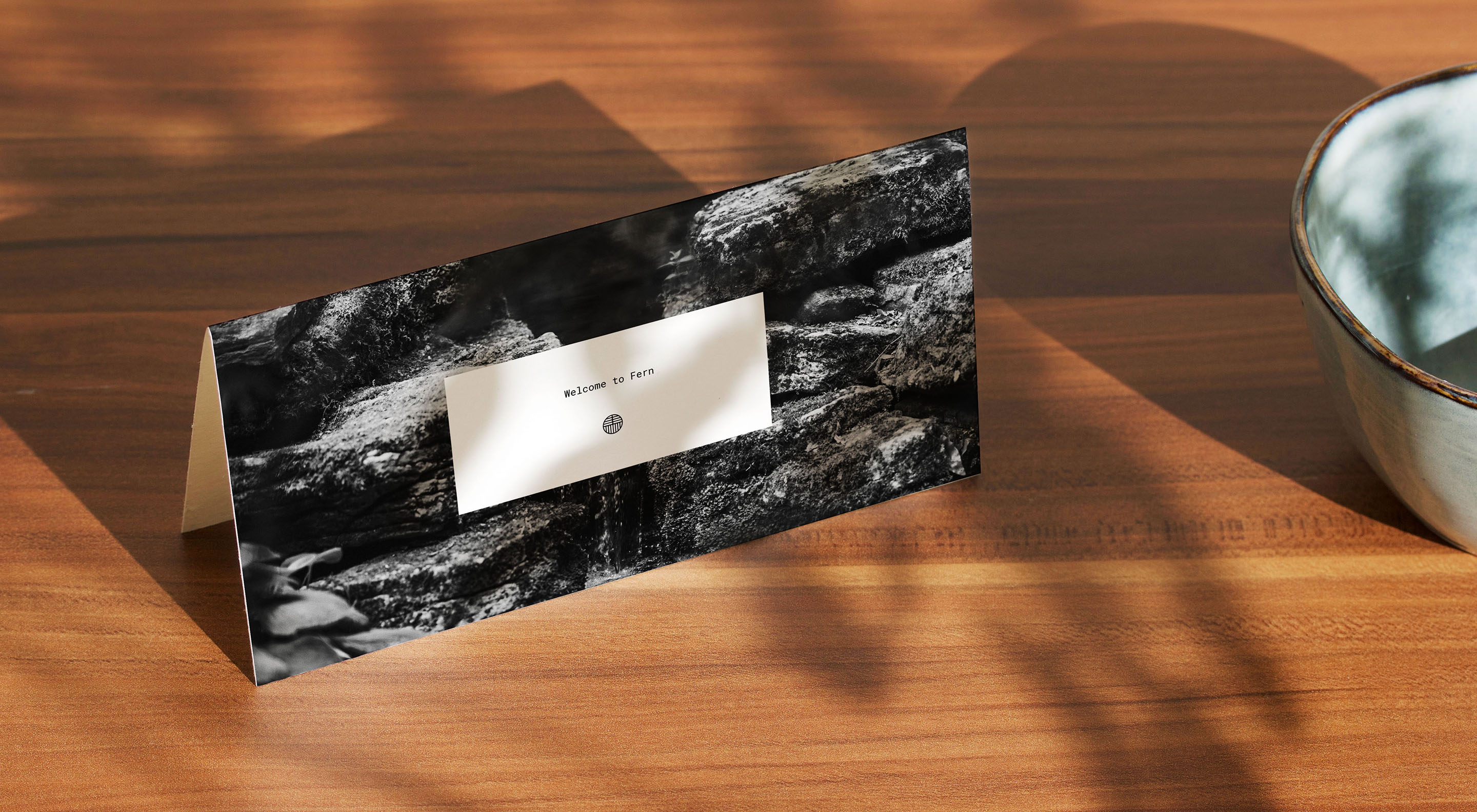
A minimalistic mark of quality, representing branches and roots was inspired by a craftsman’s mark you would find on ceramics, wood and metalwork.
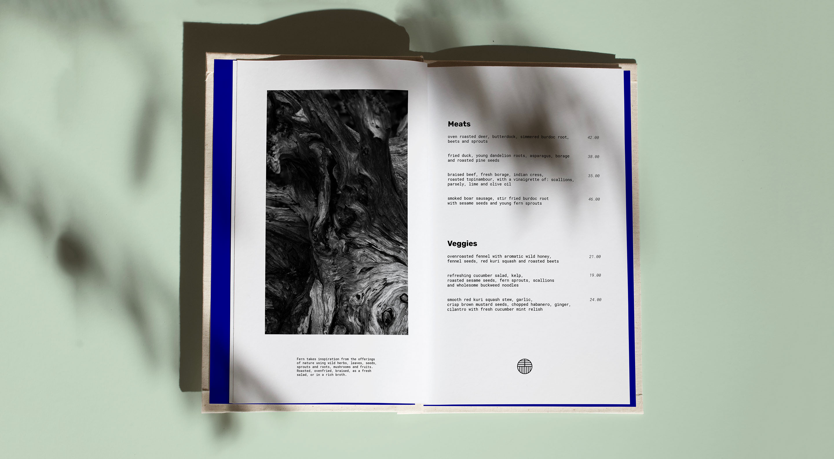
To counterbalance the warm tones of several different woods and natural materials used for Ferns interior and collateral and to emphasize on the refreshing and re-energizing qualities of their dishes as well as adding a modern and curious twist, we employed a strong blue highlight for the design collateral. The blue accent also finds use as a highlight color throughout the interior accompanied by a cool light mint green and a darker but highly saturated green.
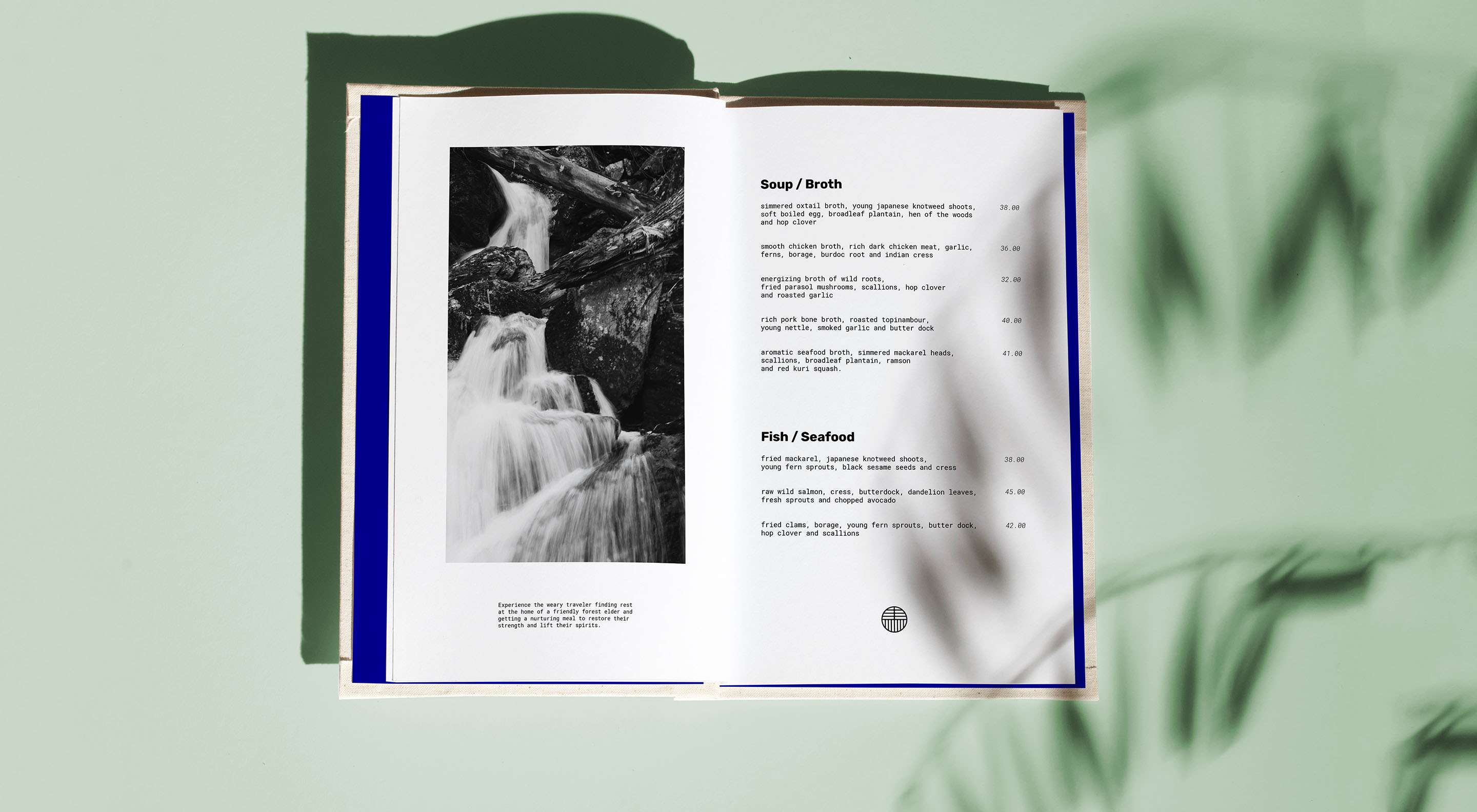
Along the logo and colors the image style played a major role in establishing the look and feel of the brand. We focused on details and textures to reflect Ferns attention to detail, establish a connection to nature and evoke emotions.
To further emphasize on the textures and add to the balance between the warm natural tones and bold but rather cool colors, the images were kept strictly in black and white.
Conclusion:
Ferns mission to bring healthy, carefully selected and foraged dishes to curious and mindful guests while providing a dining experience that creates a strong connection to nature demanded a branding that is sophisticated, but also warm and welcoming; neither being too contemporary nor too emotional.