White Snowboards is a startup creating high-end boards that express simplicity and high functionality catering to a crowd of tech enthusiasts and minimalists.
Challenge:
Help the startup acquire founding, define the audience, create an impactful branding and develop the board graphics.
Outcome:
A branding and visual identity including a Wordmark, fonts, a lookbook and branded collateral to make the brands personality visible, as well as boards graphics that are on brand and speak to an audience that is looking for a clean, utilitarian look, but also a bold look with a strong attitude.
Scope:
Strategy
Deck
Branding
Board Graphics
Lookbook
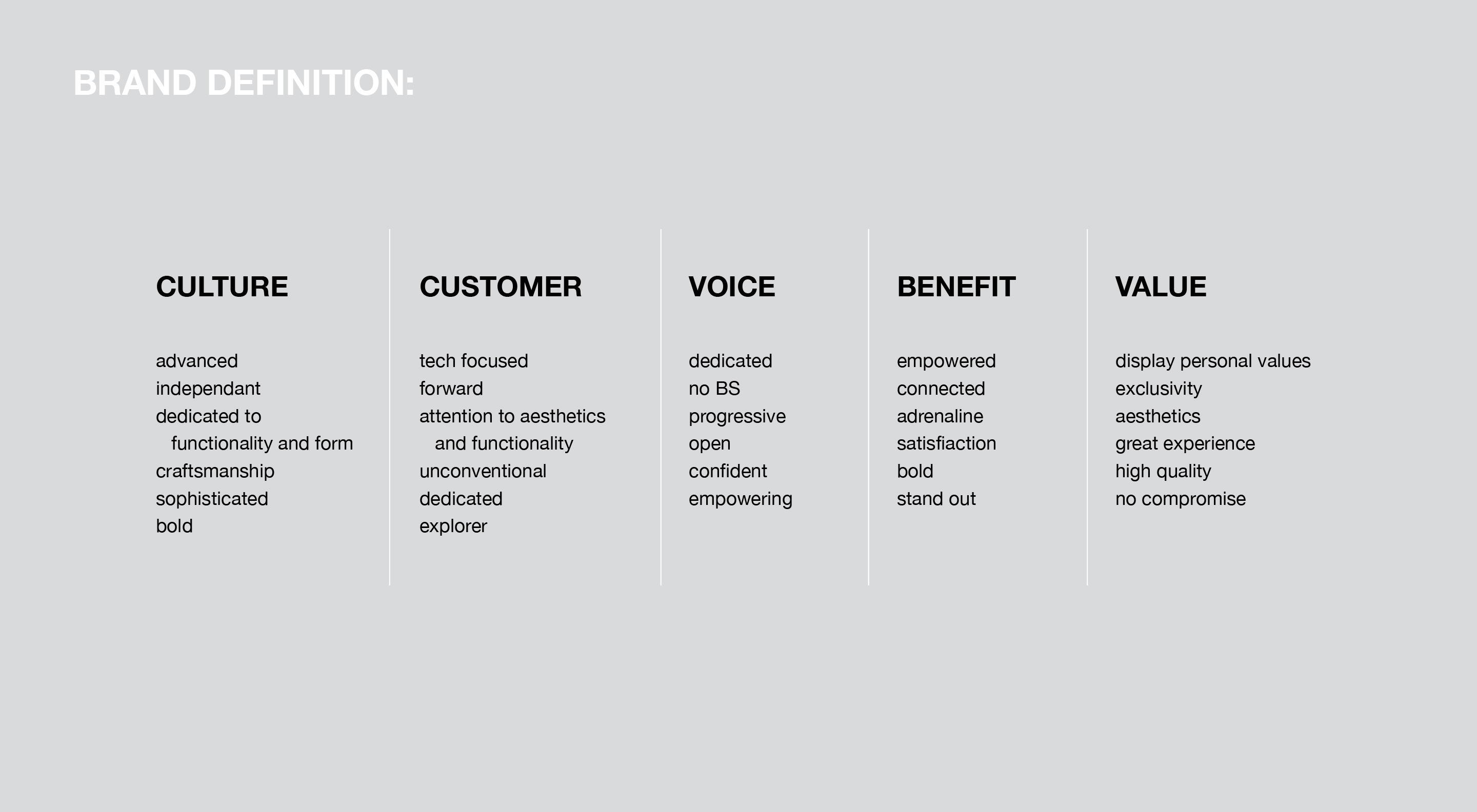
Brand Definition:
We first worked with the client to clarify and define their goals, so we could create a roadmap for upcoming objectives to make sure all design decisions stay on target.
Together with the client we explored the brands attributes, audiences needs and created user profiles to understand the direction we had to take.
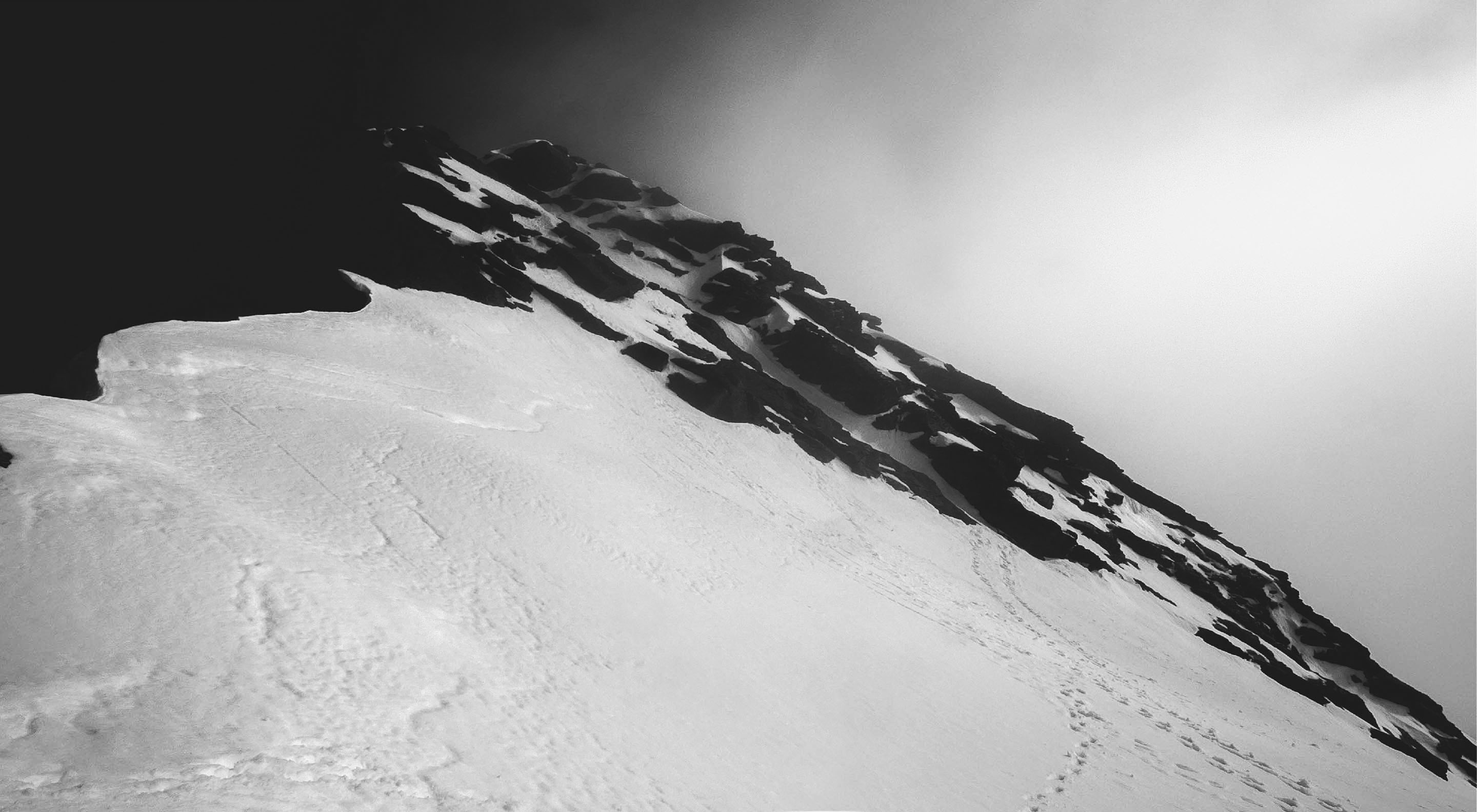
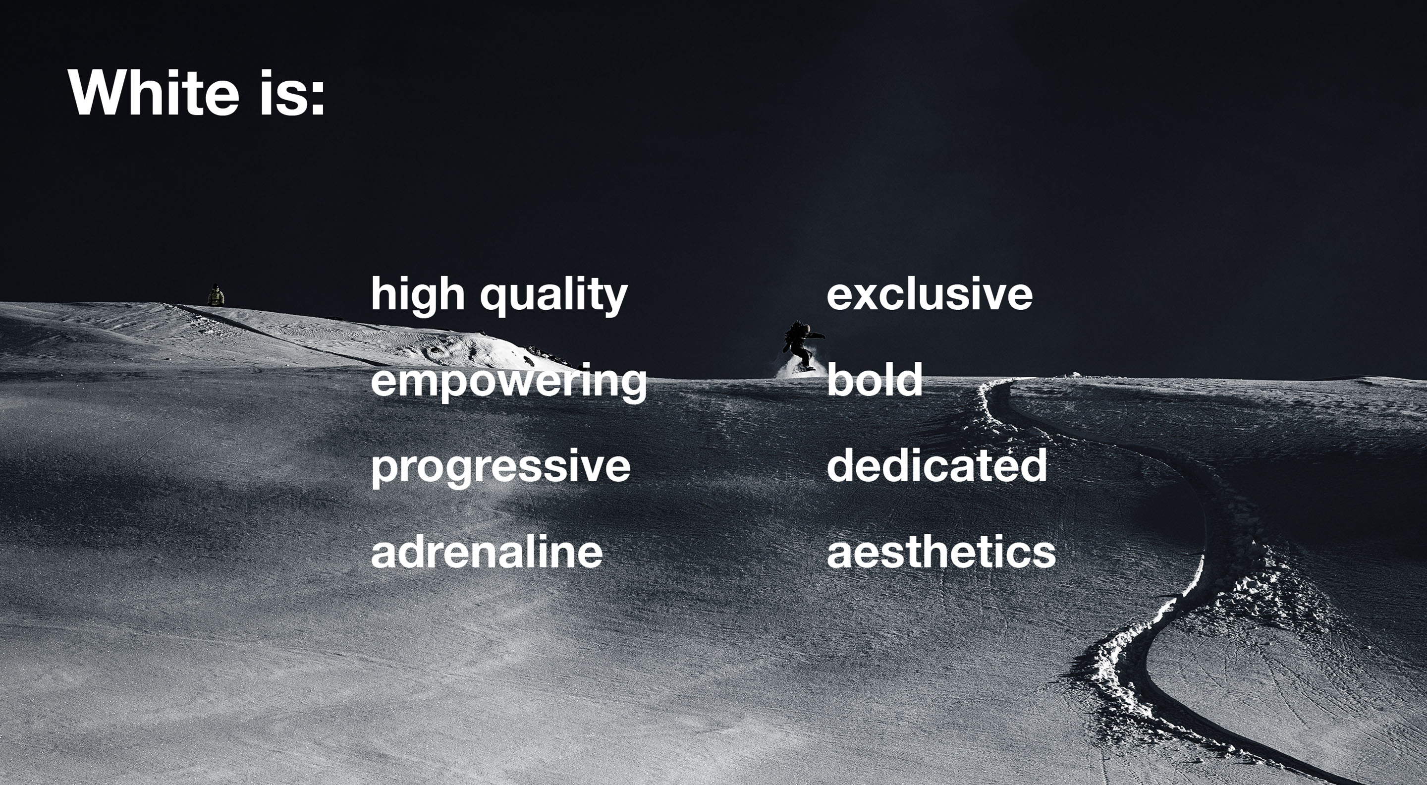
Minimal, bold, utilitarian, clean, unconventional, for a crowd of tech enthusiasts, minimalists and disruptive people who ride outside the beaten paths and appreciate craftsmanship.
With the acquired information we could begin to formulate a message and set the creative tone for the project.
Branding:
Checking our set direction against the goals defined in the strategy sessions and the clients perception we made sure our objectives aligned and set out to work on the branding.
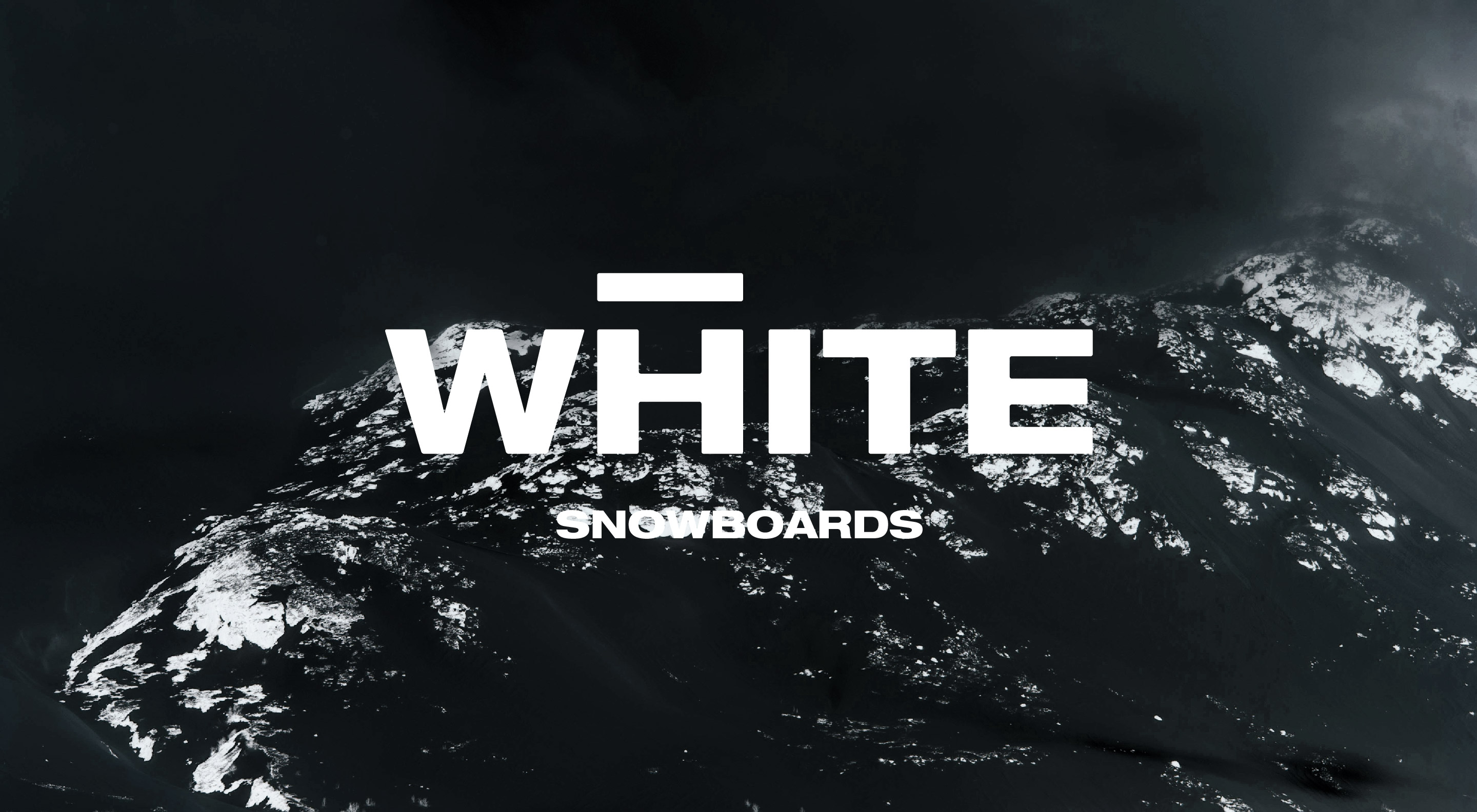
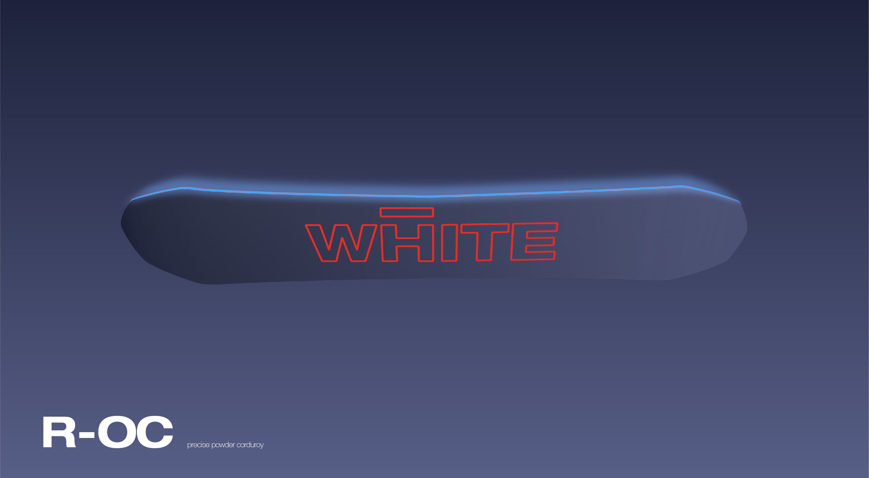
When defining the brand in our strategic approach it became already clear the direction of keeping the logo minimalistic and bold would best represent the brand.
We went several directions reducing the the aspects of snowboarding to a what is essential. The most minimalistic and bold choice turned out to be just the color of snow. After heading further in this direction we noticed that the sound of "white" is pretty close the pronunciation of the last name of the owner "Waite" (pronounced like "wait"). The client was intrigued by this discovery and we decided to head in this direction and began working on the logo.
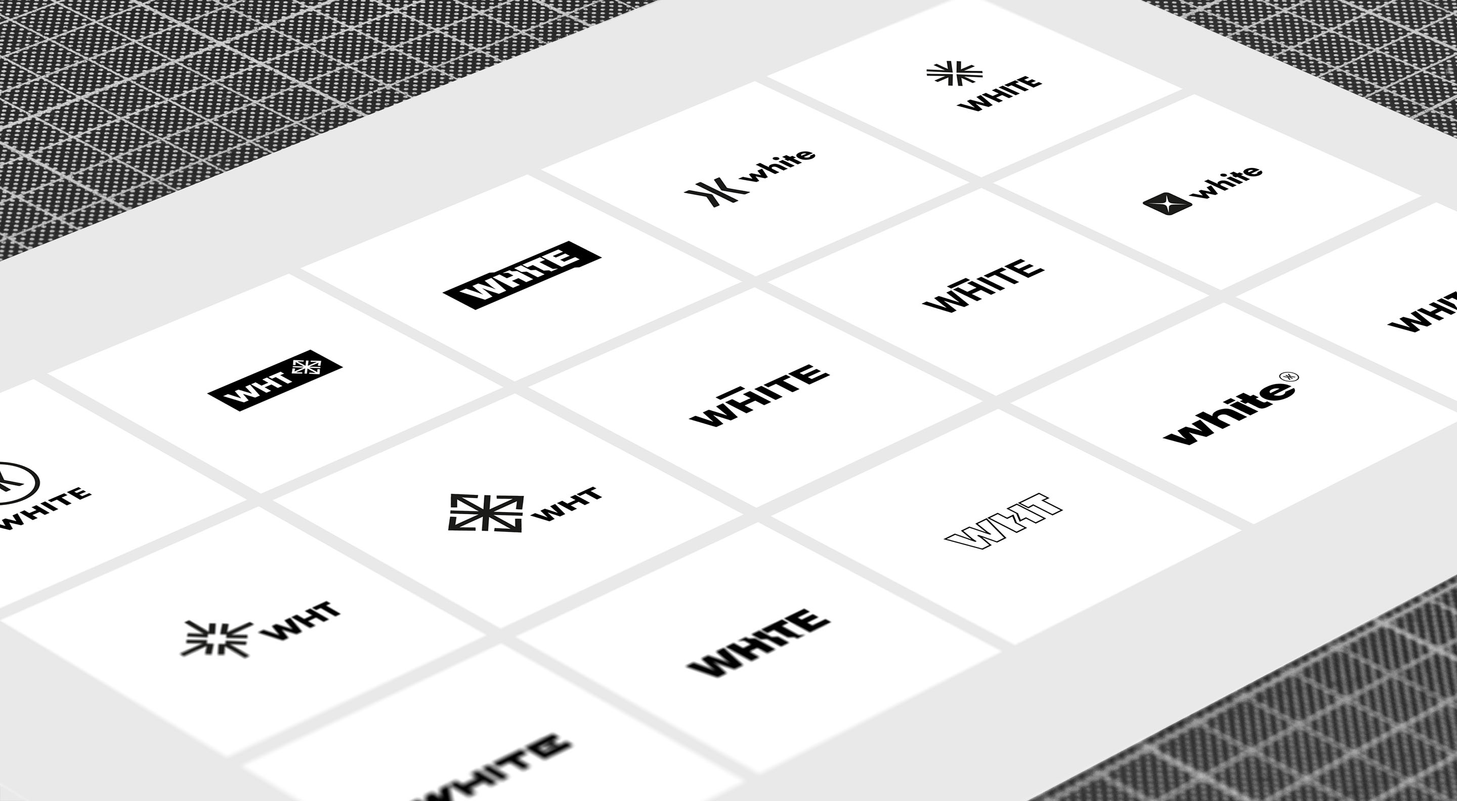
We made several iterations of with different logos and wordmarks.
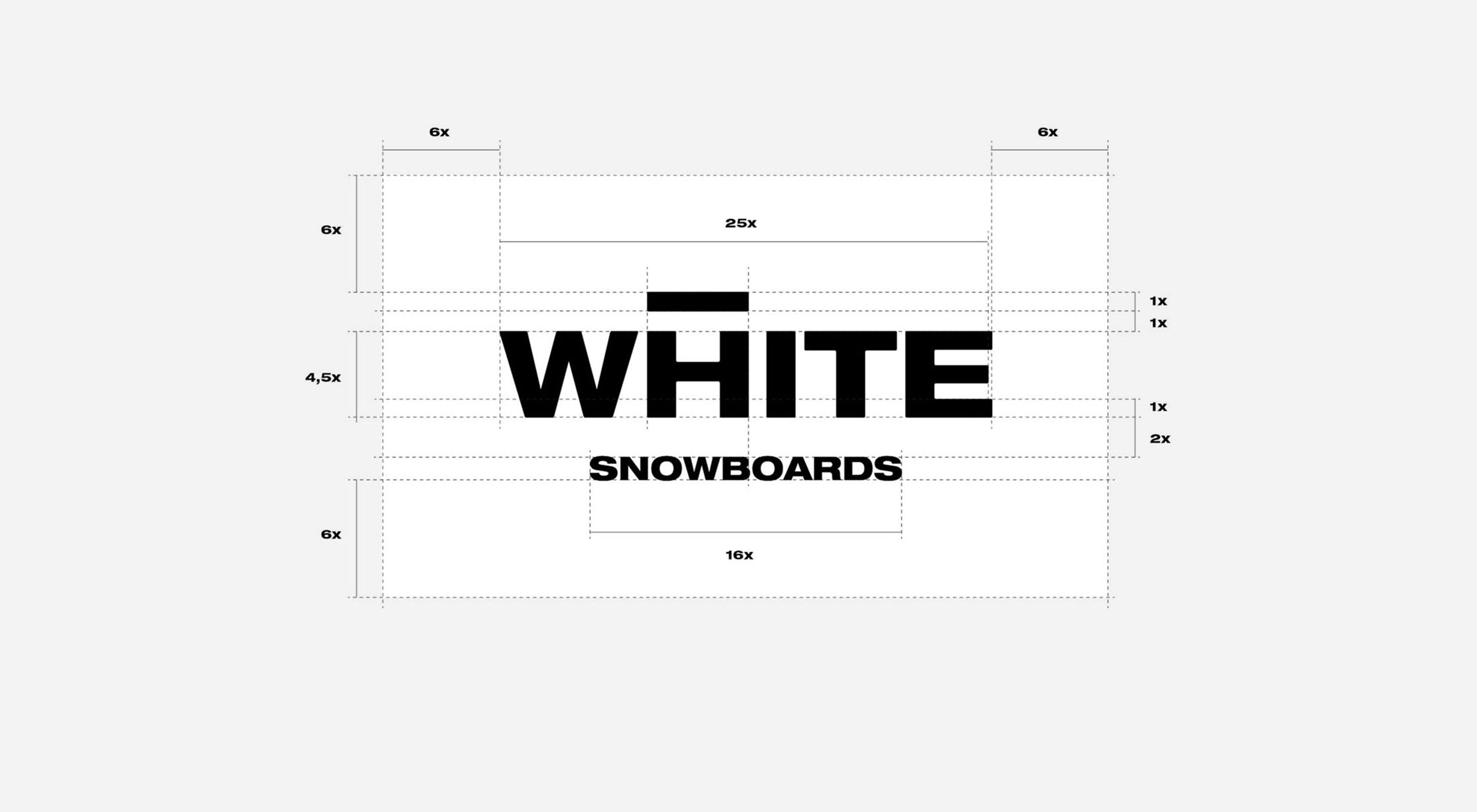
The solution turned out to be a surprisingly simple wordmark that was very much on brand. By just adding a horizontal line to the "H" in "WHITE" you can create an "A" and have "WHITE" read like "WAITE". We wanted this to be not too obvious though and the name had to be readable in both ways. We created a horizontal bar that hovers over the "H" and at first glance gives the wordmark just a unique feeling.
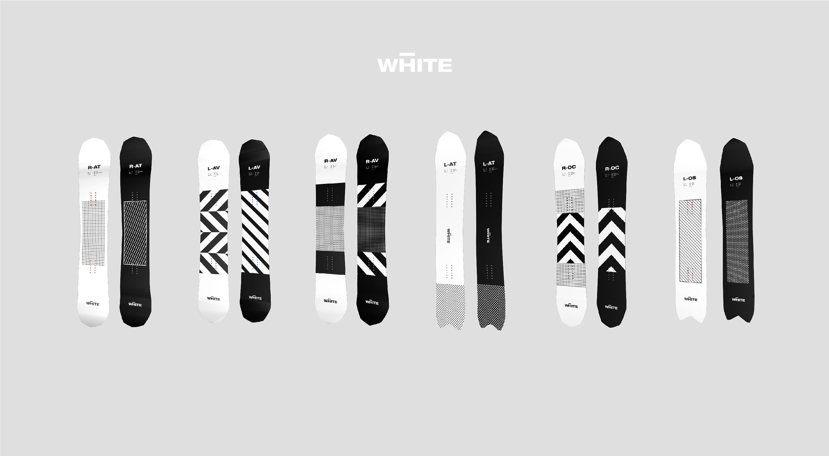
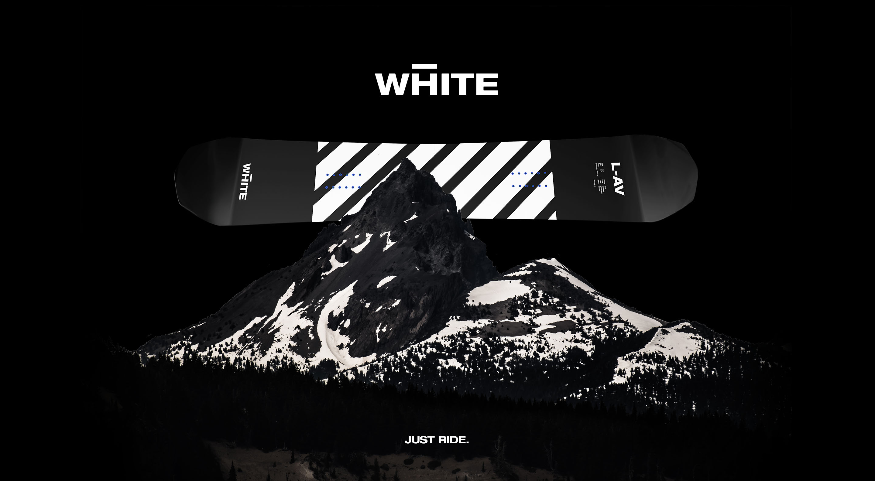
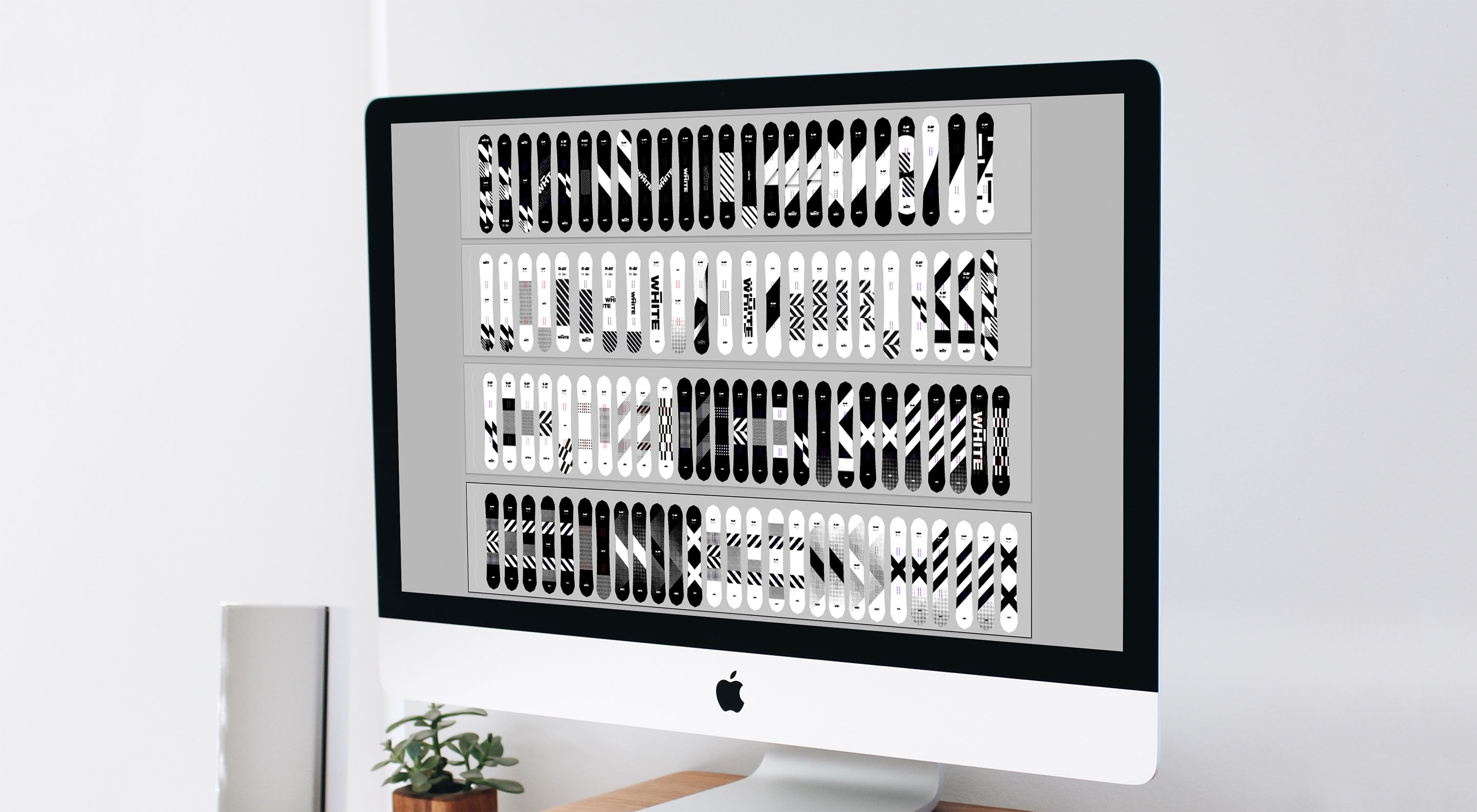
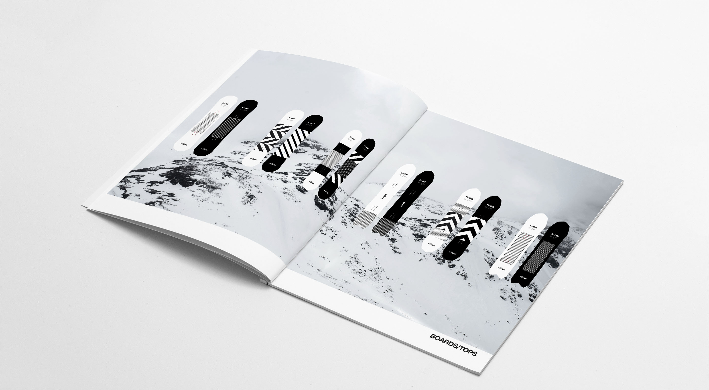
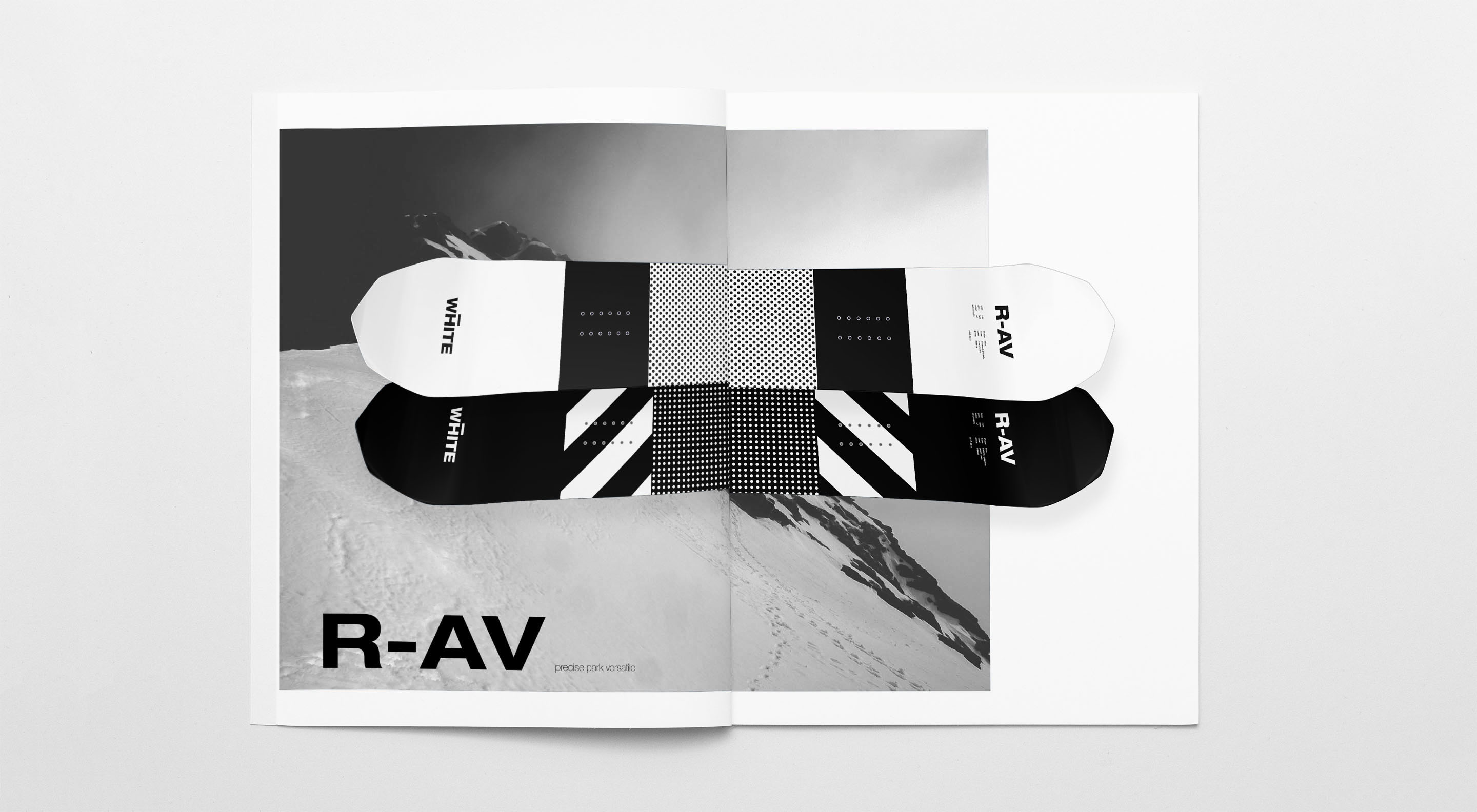
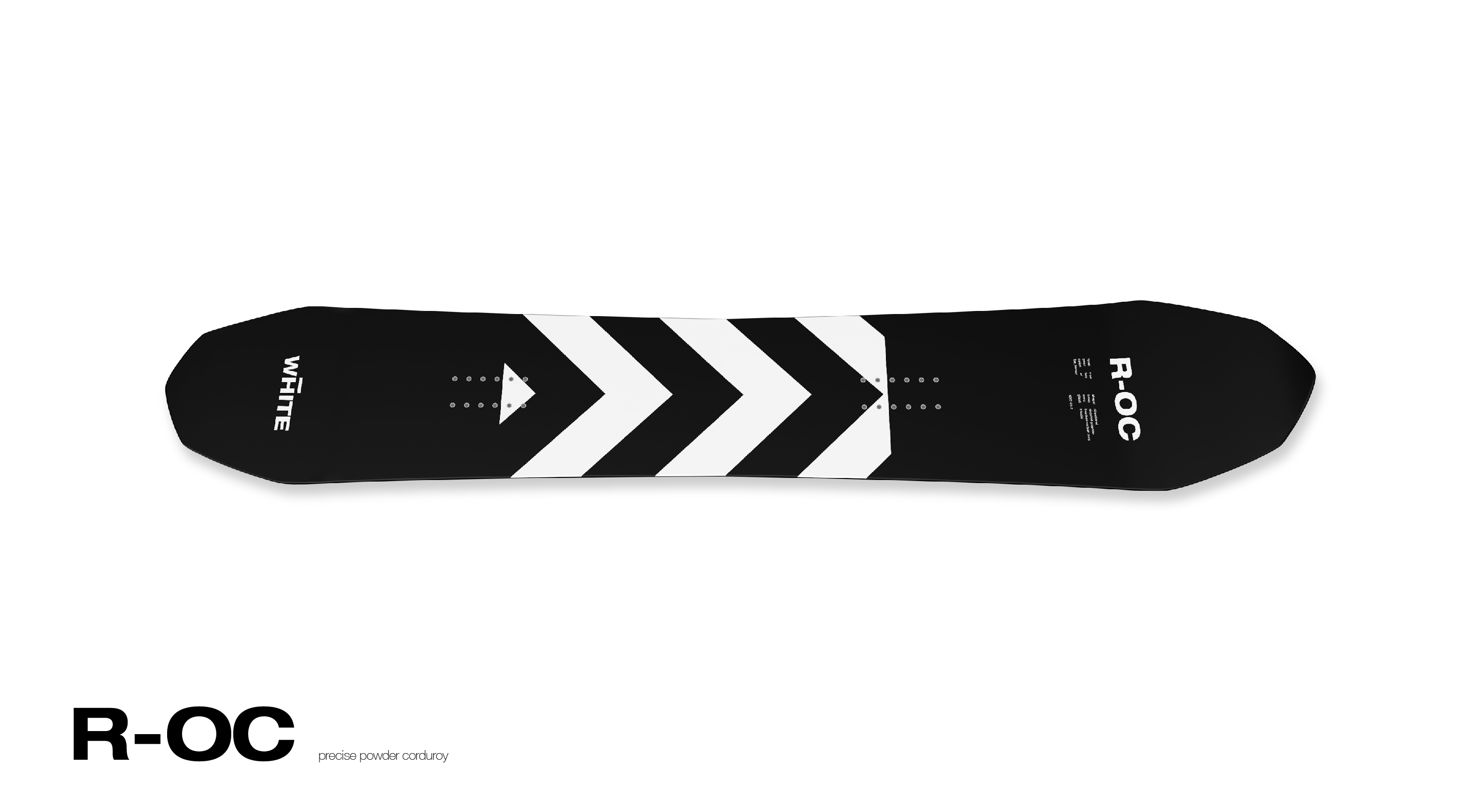
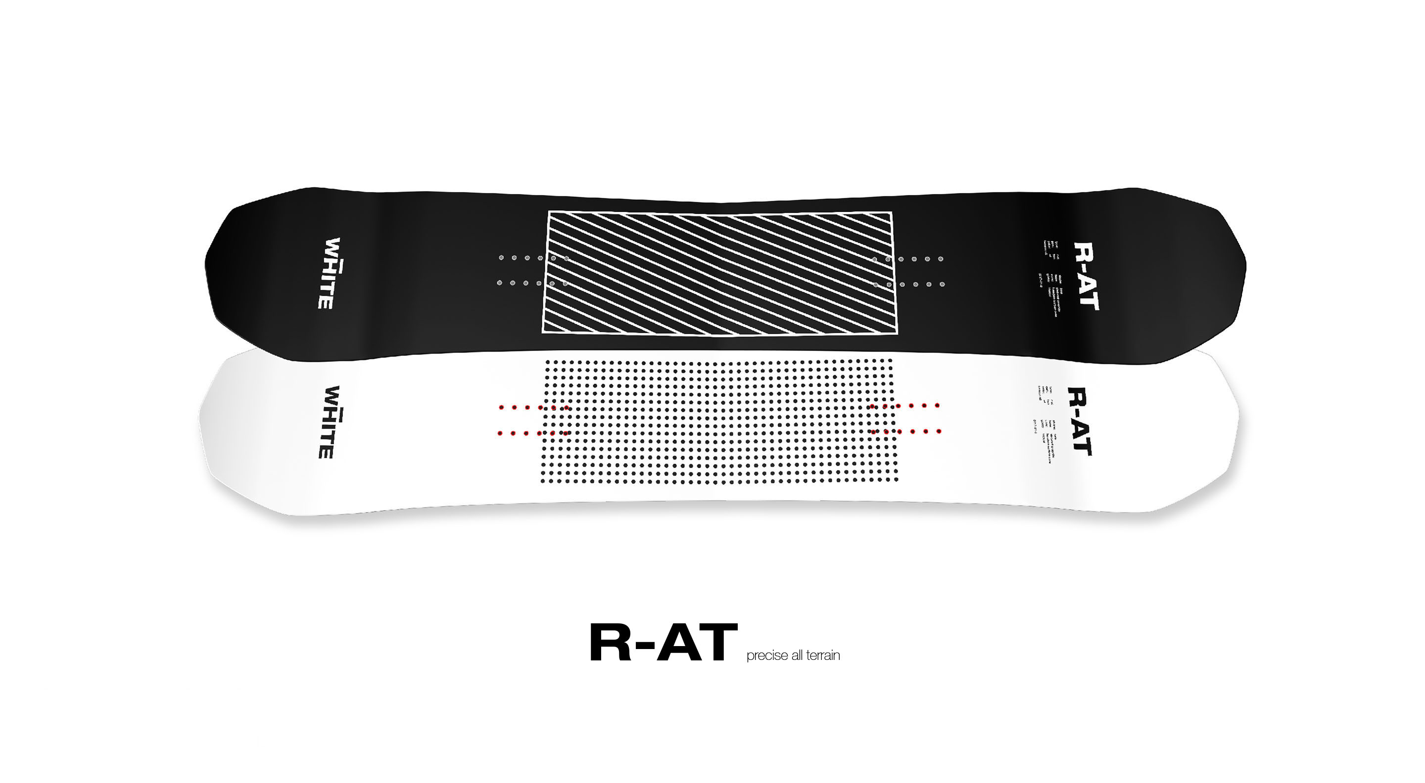
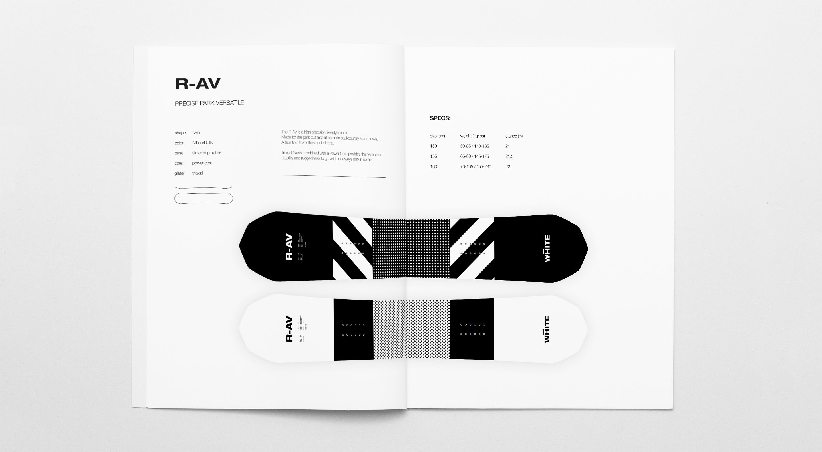
Provided with he shapes, we developed a concept for the board graphics.
Together with the client we set the direction to being bold an minimal as the brand itself. Based on brand attributes and customer definition we headed in the direction of a a bold black and white design for the tops, complimented by a beautiful gradient and logo on the bottom.
We explored different directions of black and white graphics until our focus turned towards utilitarian and industrial markings and patterns and simple graphic elements like dot gradients with out adding a lot of clutter.
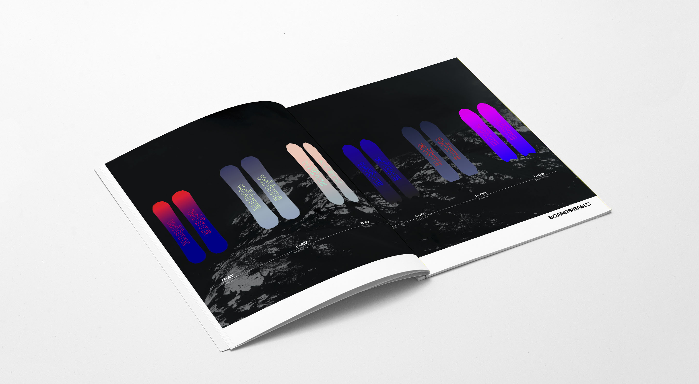
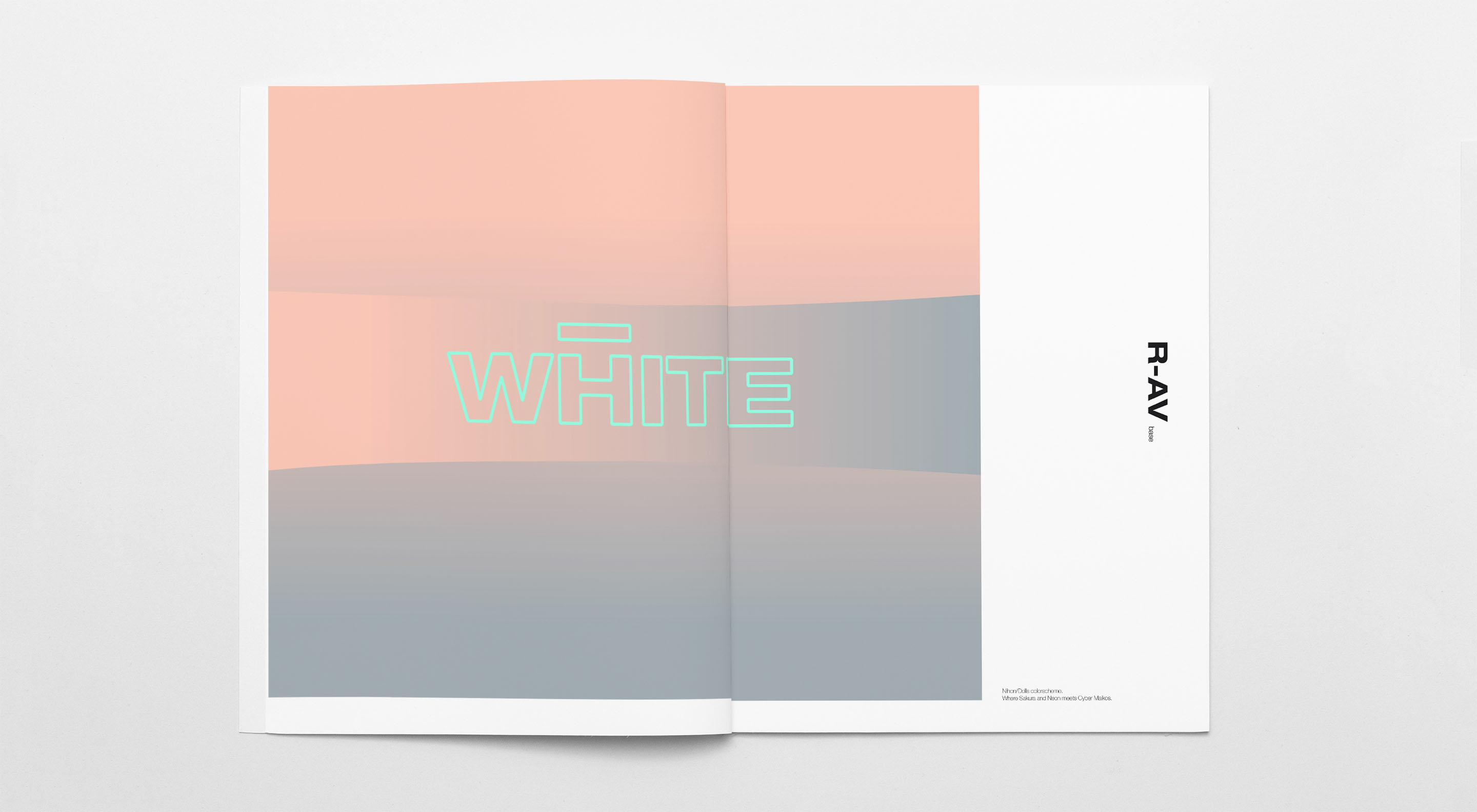
While exploring different designs for the tops and the relation to the decision making process of the customer it became clear that we didn't want to go with just one option in either black or white as the dominant color but instead give the customer the choice of a light and a dark design for each board. While designing the base we made sure that they harmonized with either Top color.
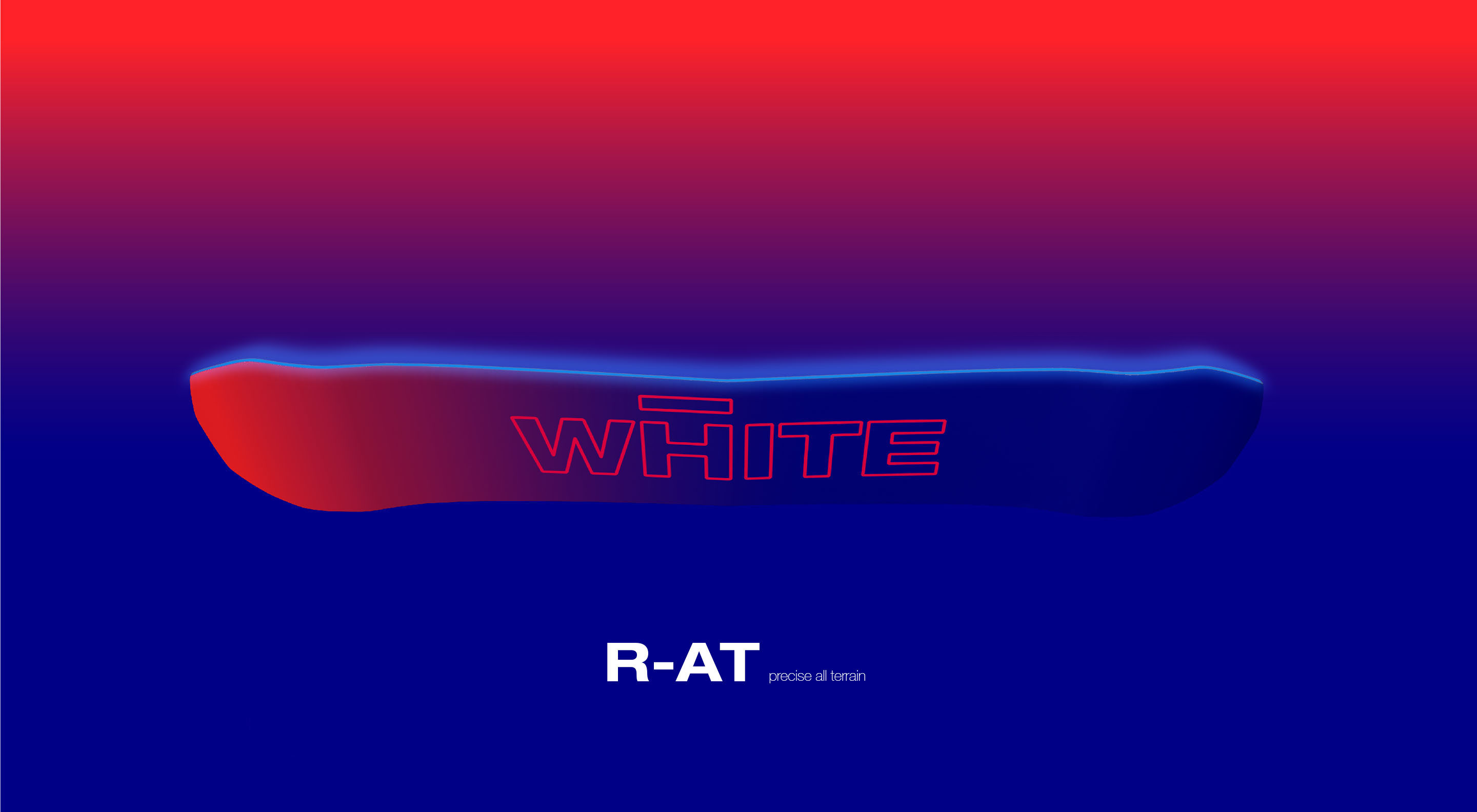
We developed names for the base gradients that give them a mood and a hint of a story either based on images that influenced the color scheme or where the color scheme created a story for us on it's own. The L-AVs base "Substation @3 A.M." was indeed influenced by a moody image of a substation/transformer drenched in neon light on a foggy winter night.
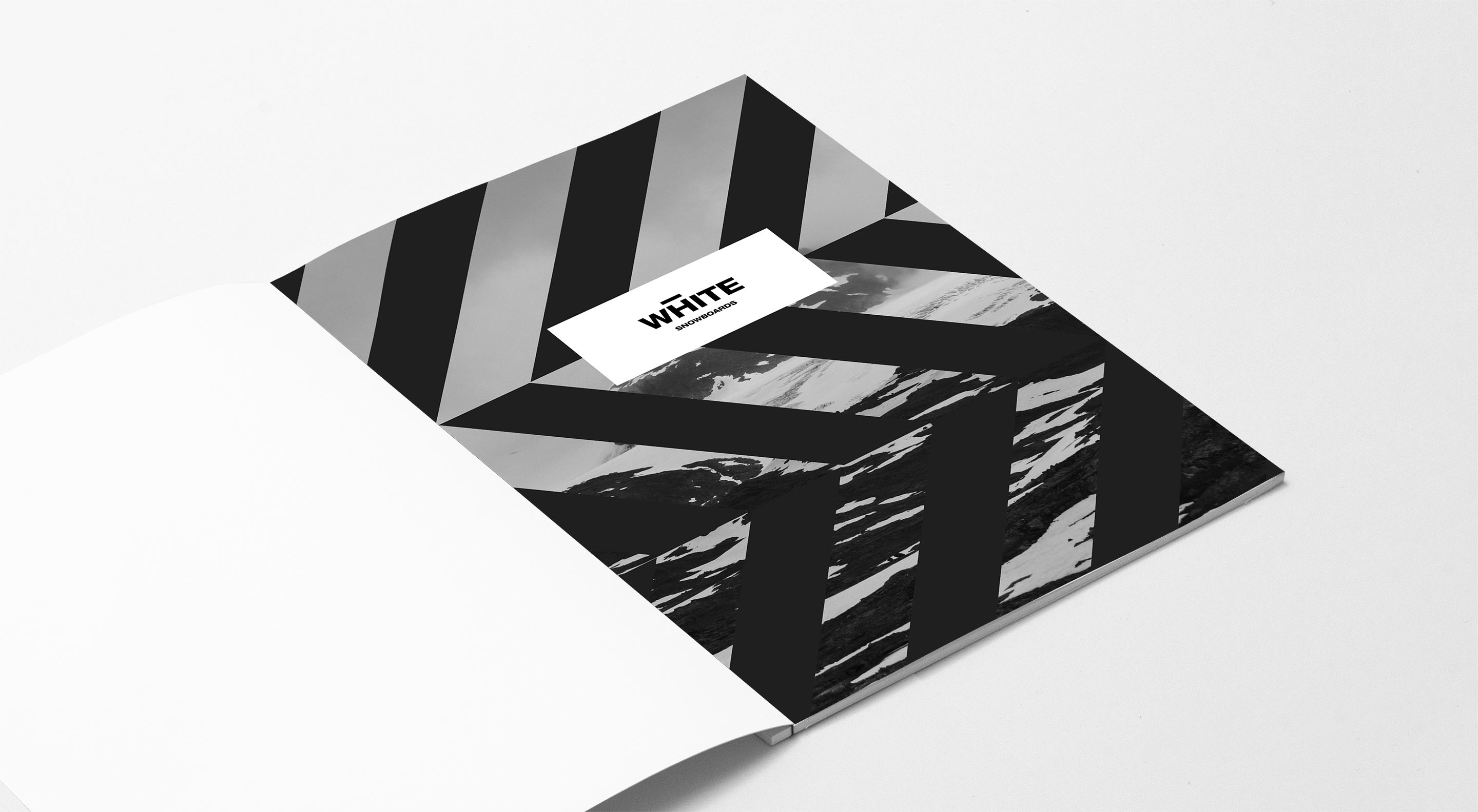
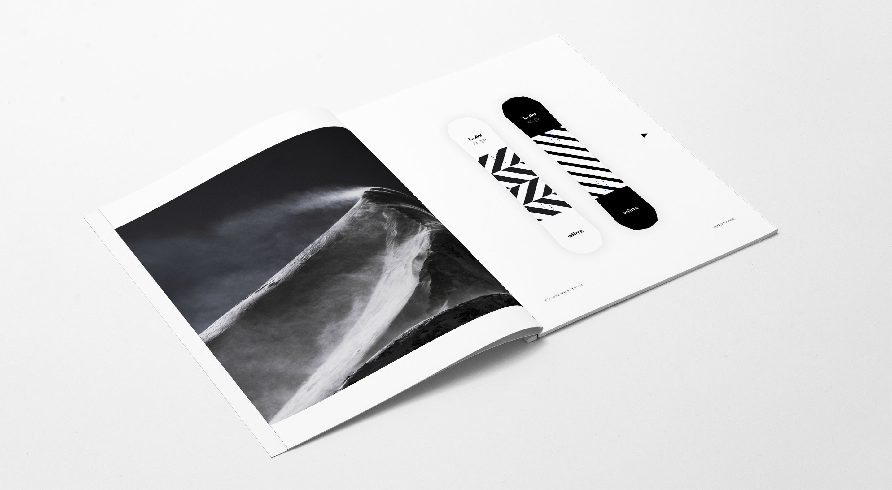
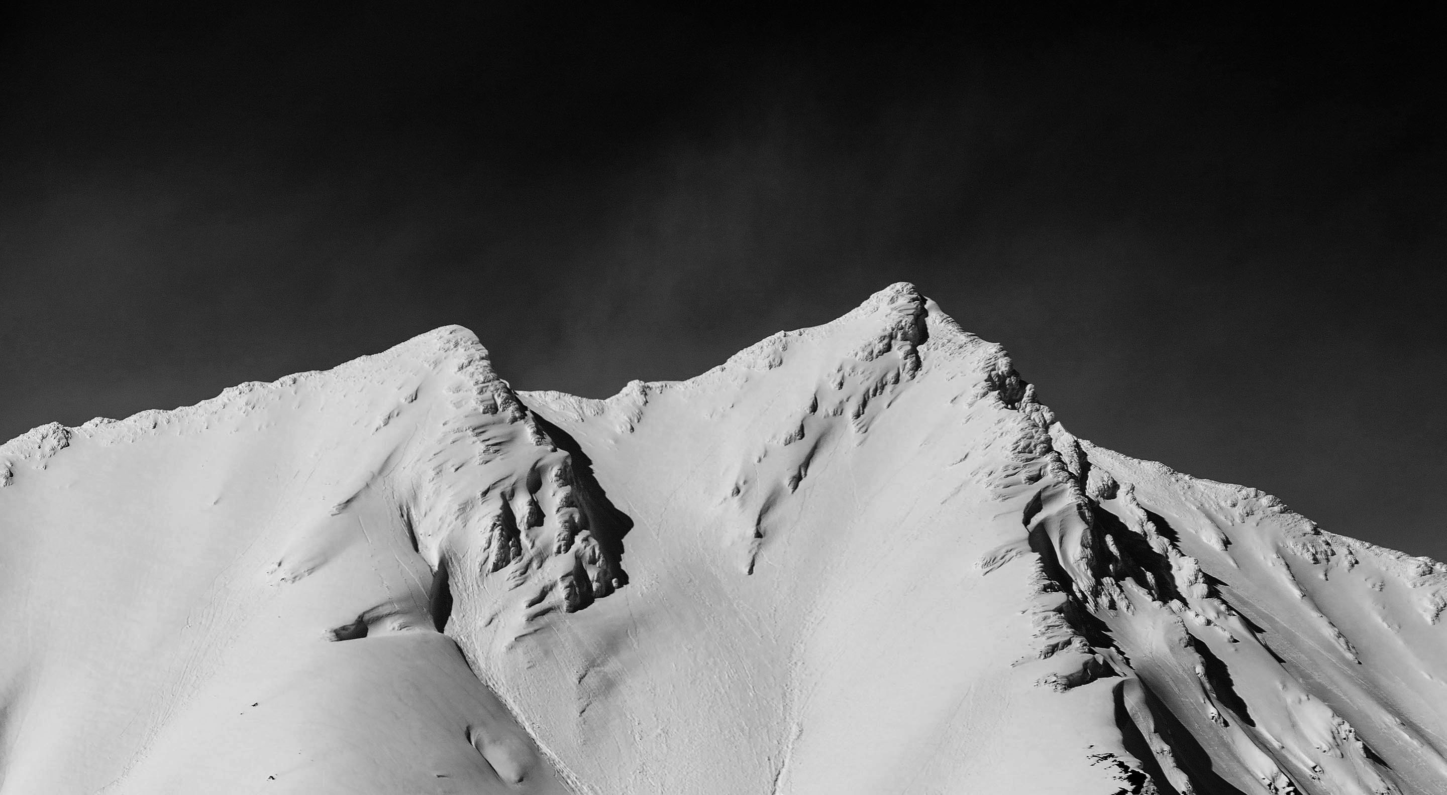
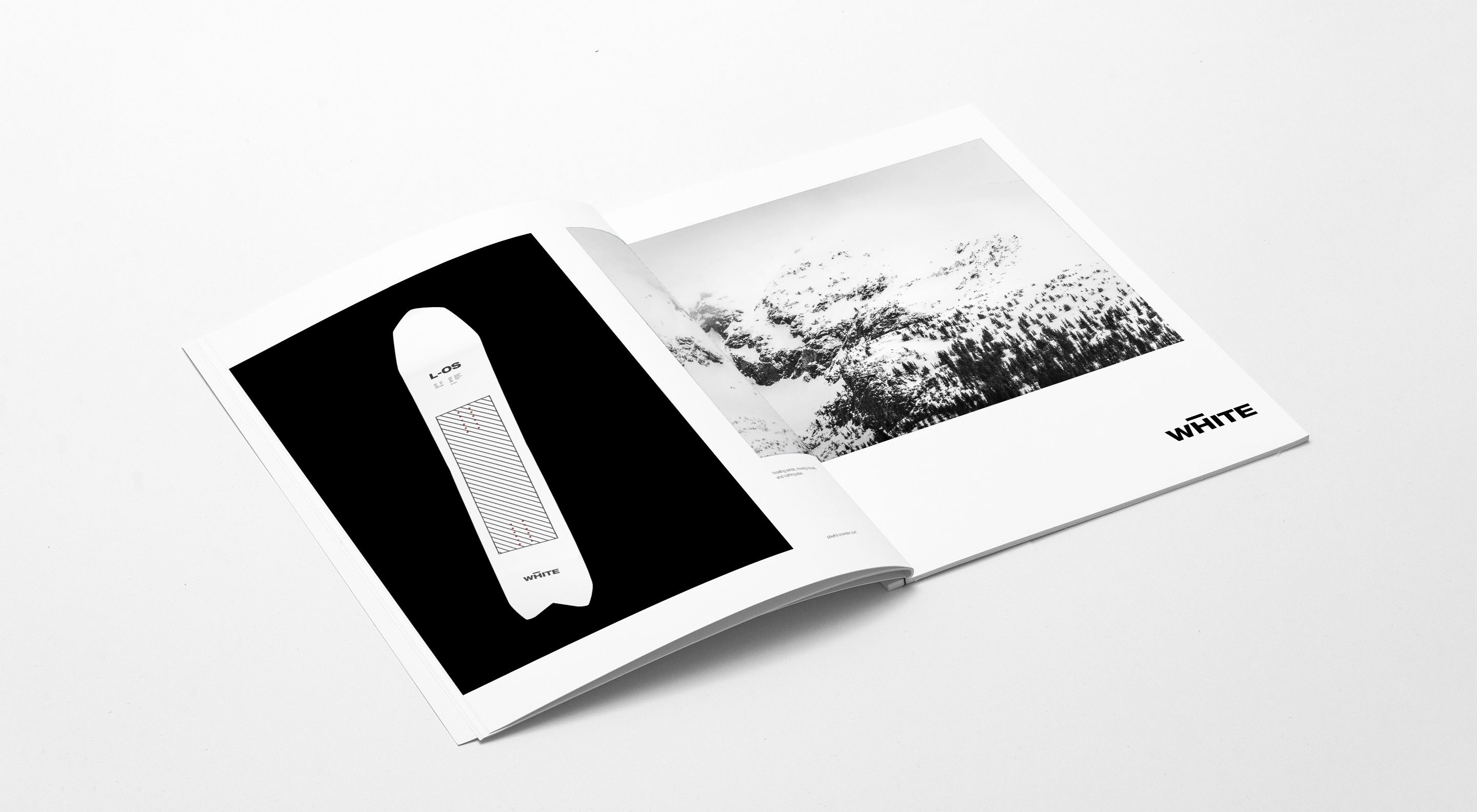
When creating the lookbook we faced a challenge. As White had only acquired seed money from friends and family and no funding from outside investors yet, supporting the deck was one of the purposes of the lookbook after all, only a few prototype boards existed in various conditions. We explored the option to hire a photographer, shoot the prototypes in action and retouch all images with the new graphics, but we felt that in regards of time and budget that was not the best option. We decided to go with 3D models instead and and combine minimalistic product shots with moody images. We felt that this direction not only was the best solution time and budget wise, but also worked great within the branding.
Our goal was to create something that doesn't try to sell but rather offers an experience that the audience wants to become part of.
It also aims to convey the brand values and tell the story behind of the brand.
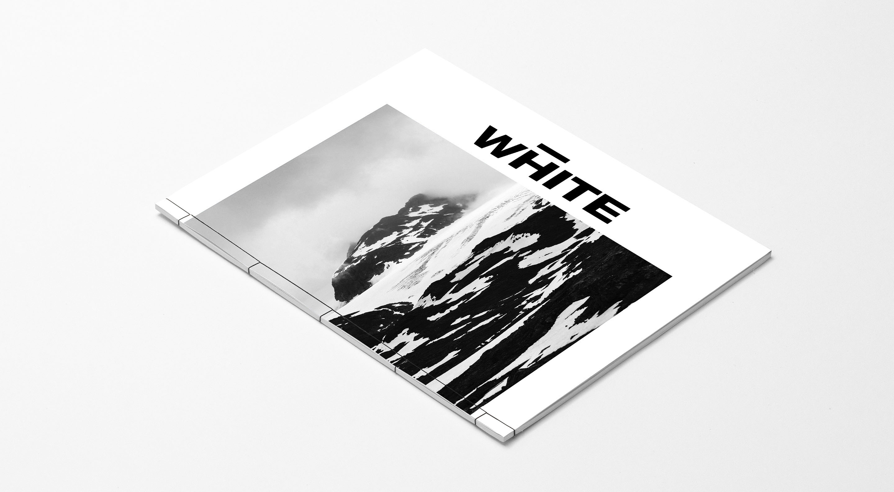
To reflect the brands attention to detail we opted for a Japanese binding instead of the common stapling or saddle stitching.
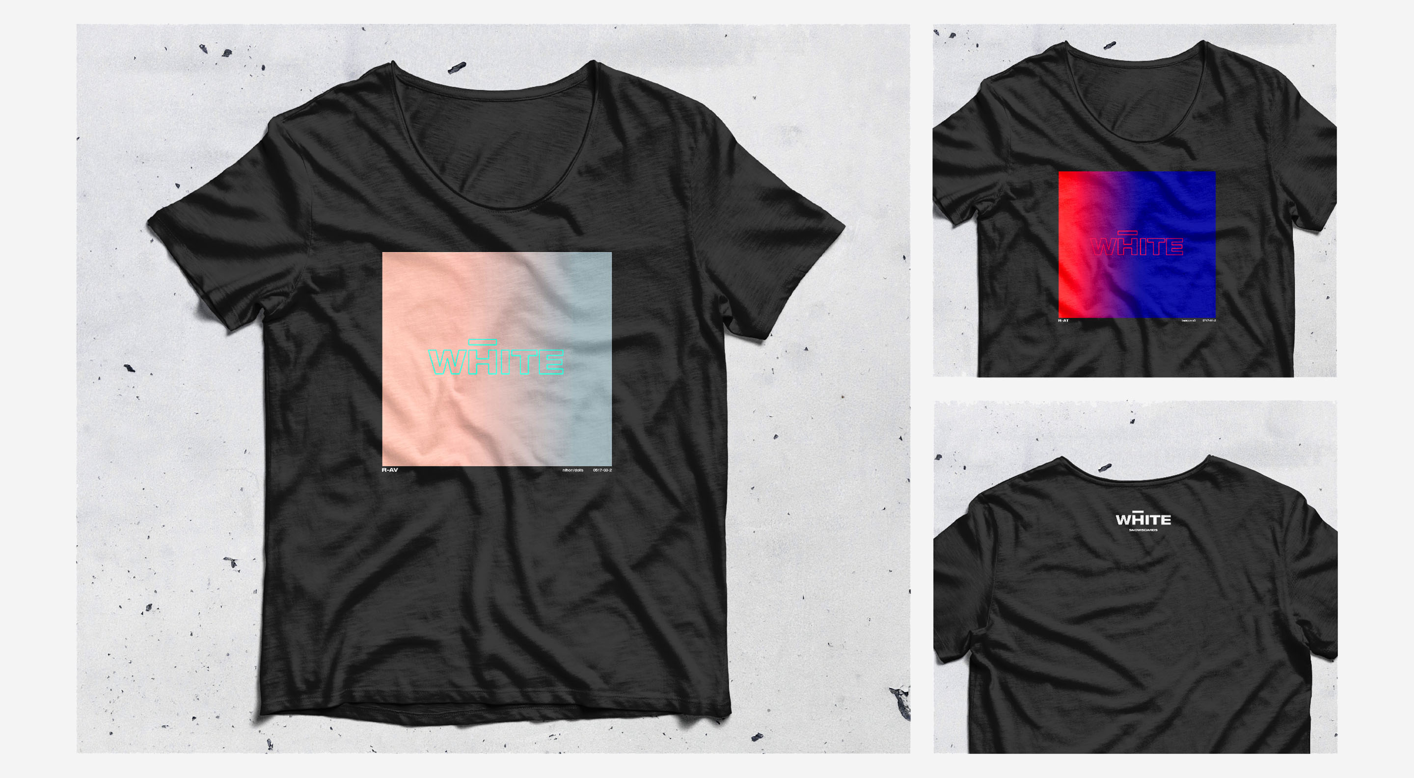
To create traction early on, have something to give away and get people excited, we created a series of minimalistic t-shirt designs based on the boards base graphics.
Conclusion:
To communicate the brands values, speak to a bold, minimalistic, tech-driven crowd that ventures of the beaten paths and showcase the brands potential required a branding that is bold and strong, yet not overly loud while the same time being minimal, yet not restrained.